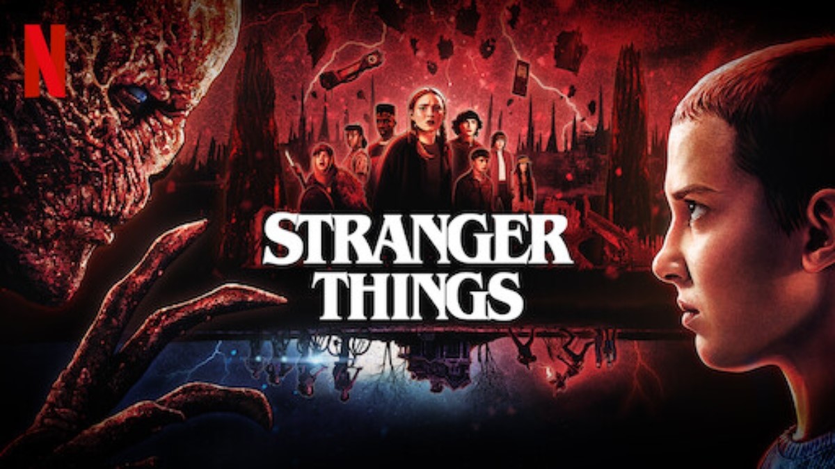
Stranger Things has a lot of iconic elements surrounding it. Fans love the characters and the ‘80s setting. They love the consistent parallels to Dungeons and Dragons. And who could forget the Upside Down, the terrifying yet somewhat alluring realm that continuously gives viewers more questions than answers?
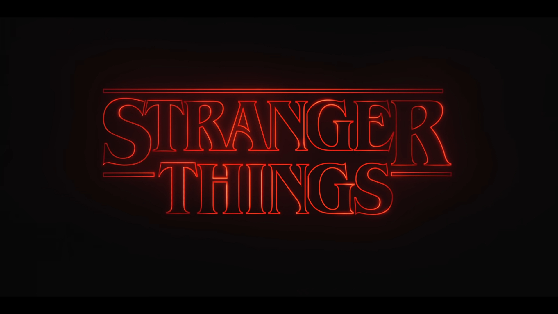
Another popular aspect of the show? Its logo. Go to a café in any big city, go to the mall, or walk around a university campus; there’s a pretty good chance someone is rocking a Stranger Things shirt. The show’s title and signature logo, with its red color and iconic font, have grown so popular that they’ve simply become a general and noticeable part of mainstream pop culture.
Speaking of that dashing crimson logo, for those interested in a bit of typography, the logo’s now famous typeface is known as “ITC Benguiat,” named after its founder, Ed Benguiat (per Vox). And that special font is just one piece of an intricate puzzle when it came to crafting the show’s iconic intro sequence.
Stranger Things has arguably one of the greatest title sequences in streaming today

In 2017, Vox sat down with Michelle Dougherty of Imaginary Forces, the studio behind Stranger Things’ retro title opening. Dougherty broke down the creation process behind the title card and how crucial the opening was: “You want it to feel, original, you want it to feel like that title sequence couldn’t work in front of another show.”
Touching on the initial inspiration for the opening sequence, Dougherty discussed how the Matt and Ross Duffer, the creators of the hit Netflix series, had sent her and her team paperback novels from the ’80s. Dougherty and Imaginary Forces saw a recurring pattern in the typography on the book covers and, with the help of the brilliant crew over at Contend, went to work.
Almost in a backstage homage to the show’s setting and how things were done before, Imaginary Forces got old-school with their work. In order to create a “grittier” and almost “imperfect” title card, Dougherty and her team printed out the required letters on an older type of film known as “Kodaliths” (per Vox). Kodaliths can help create some high-contrasting images, and after blasting these letters with light to see how they would look, Imaginary Forces used the results as building blocks before finishing everything up with digital animation. And that’s how Stranger Things‘ opening sequence looks kind of modern, and kind of old, at the same time.
What’s the story behind the ‘Stranger Things’ logo?
Updated Flash Report
0 Comments